
TECVAYLI
Bringing clarity, humanity, and visual consistency to a complex oncology brand.
CLIENT
Johnson & Johnson Oncology
BRAND
TECVAYLI
ROLE
Group Art Supervisor
SCOPE
Brand System | Campaign Art Direction | HCP Digital | VSA | Responsive

OVERVIEW
I worked on TECVAYLI, a Johnson & Johnson Oncology brand, helping shape a connected visual experience across brand expression, HCP communications, digital and sales enablement. This reconstructed case study highlights the system, thinking, and design approach behind the work.
THE CHALLENGE
TECVAYLI needed to communicate highly complex oncology science across a broad ecosystem of materials — from digital experience and HCP education to sales and campaign expression. The challenge was to create a visual system that could remain clinically credible while still feeling human, optimistic, and unmistakably branded.
BRAND OVERVIEW
A visual system built to balance science, confidence, and humanity.
I reconstructed a concise brand-system view to show how the TECVAYLI identity operates across color, typography, logo usage, imagery, and graphic language. It’s a system capable of holding both high-emotion campaign storytelling and dense clinical communication.
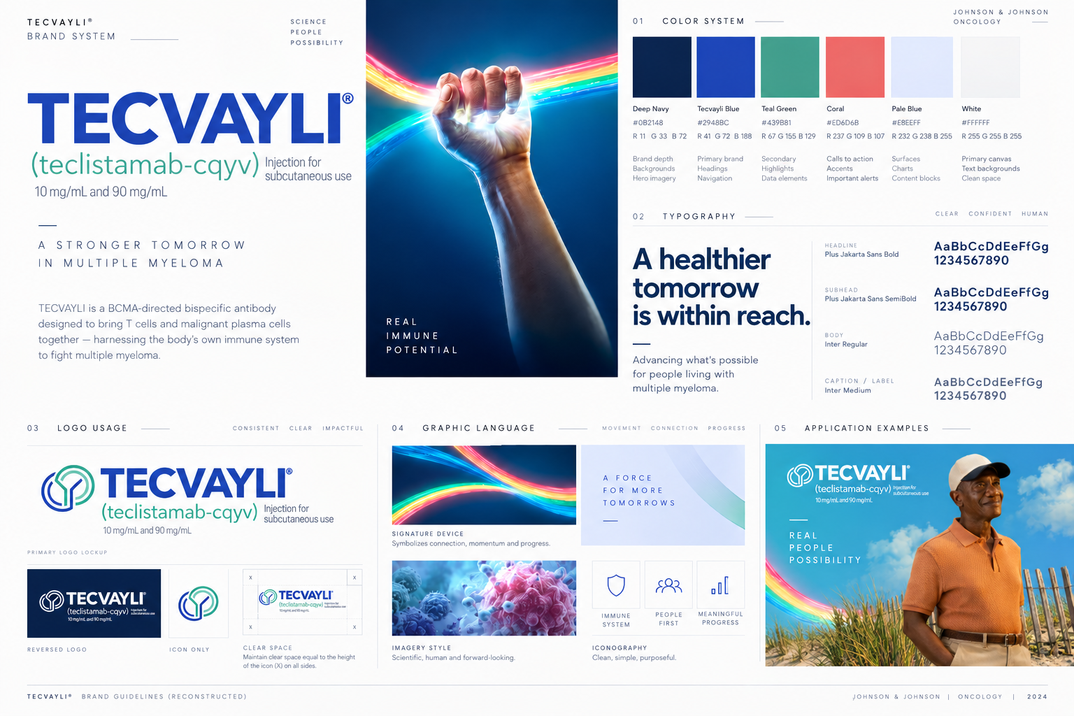
An abstract visual language for connection, momentum, and possibility.
The spectrum hand visual also known as the “Rainbolt” became a powerful shorthand for the brand signaling progress, activation, and optimism. It provided a high-impact emotional anchor that could sit alongside more detailed scientific and clinical content.
CAMPAIGN DIRECTION
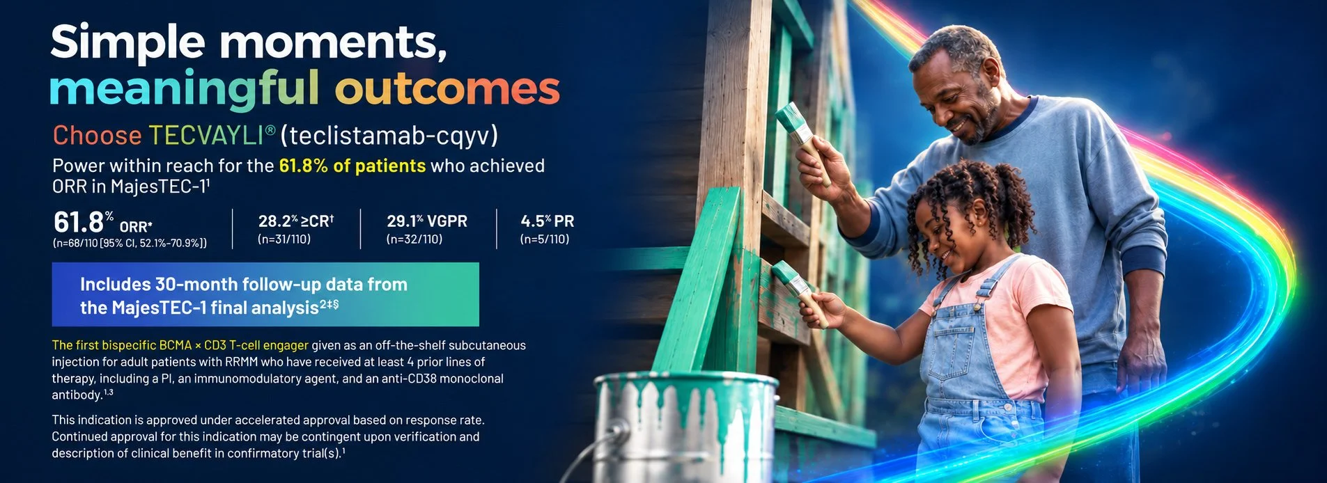
Simple moments and meaningful outcomes
To complement the abstract brand language, the campaign system needed a more human expression rooted in everyday life, connection, and possibility. We wanted to emphasize smaller moments in life that make larger memories and impacts.
DIGITAL DEPLOYMENT
A visual system built to balance science, confidence, and humanity.
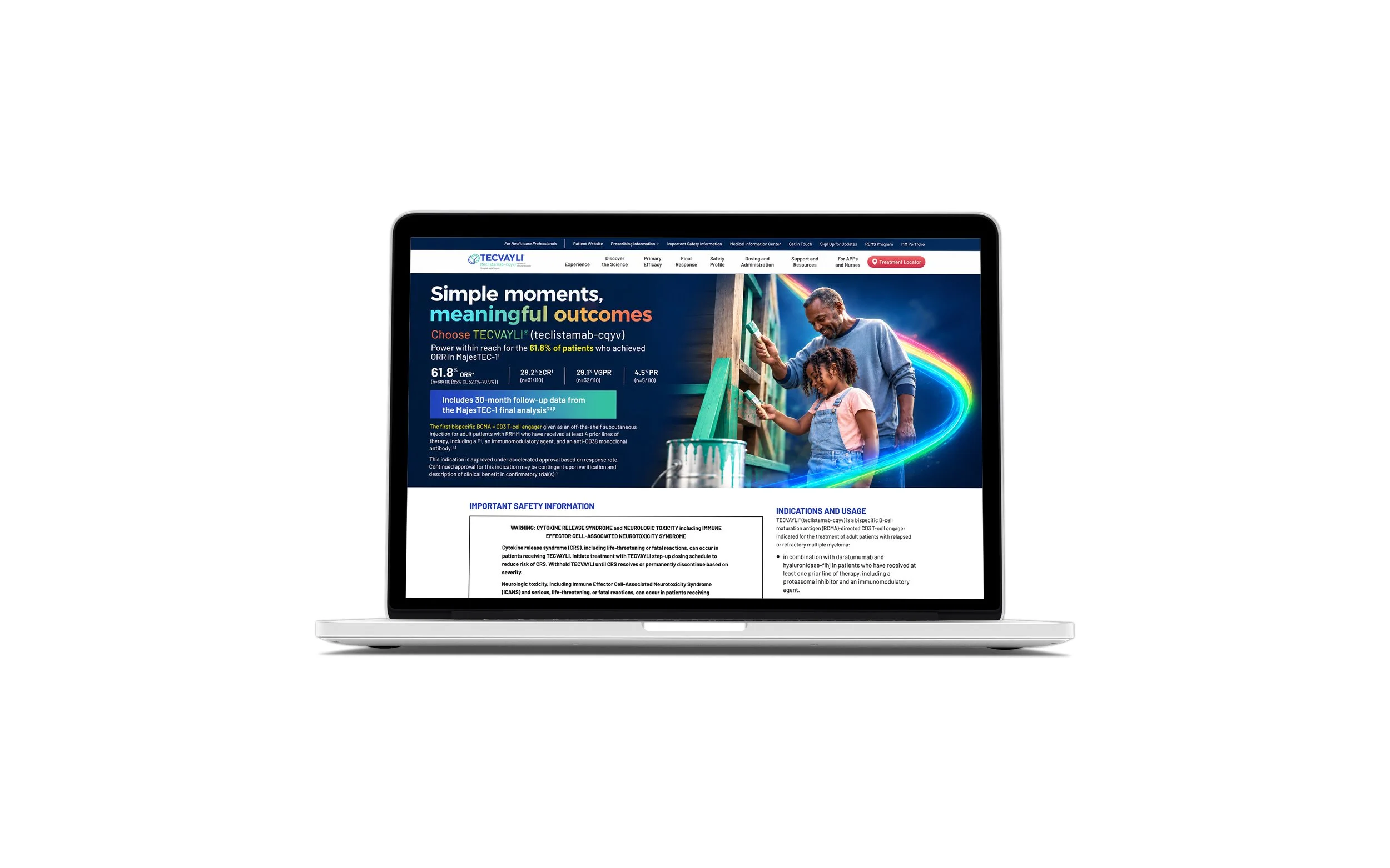
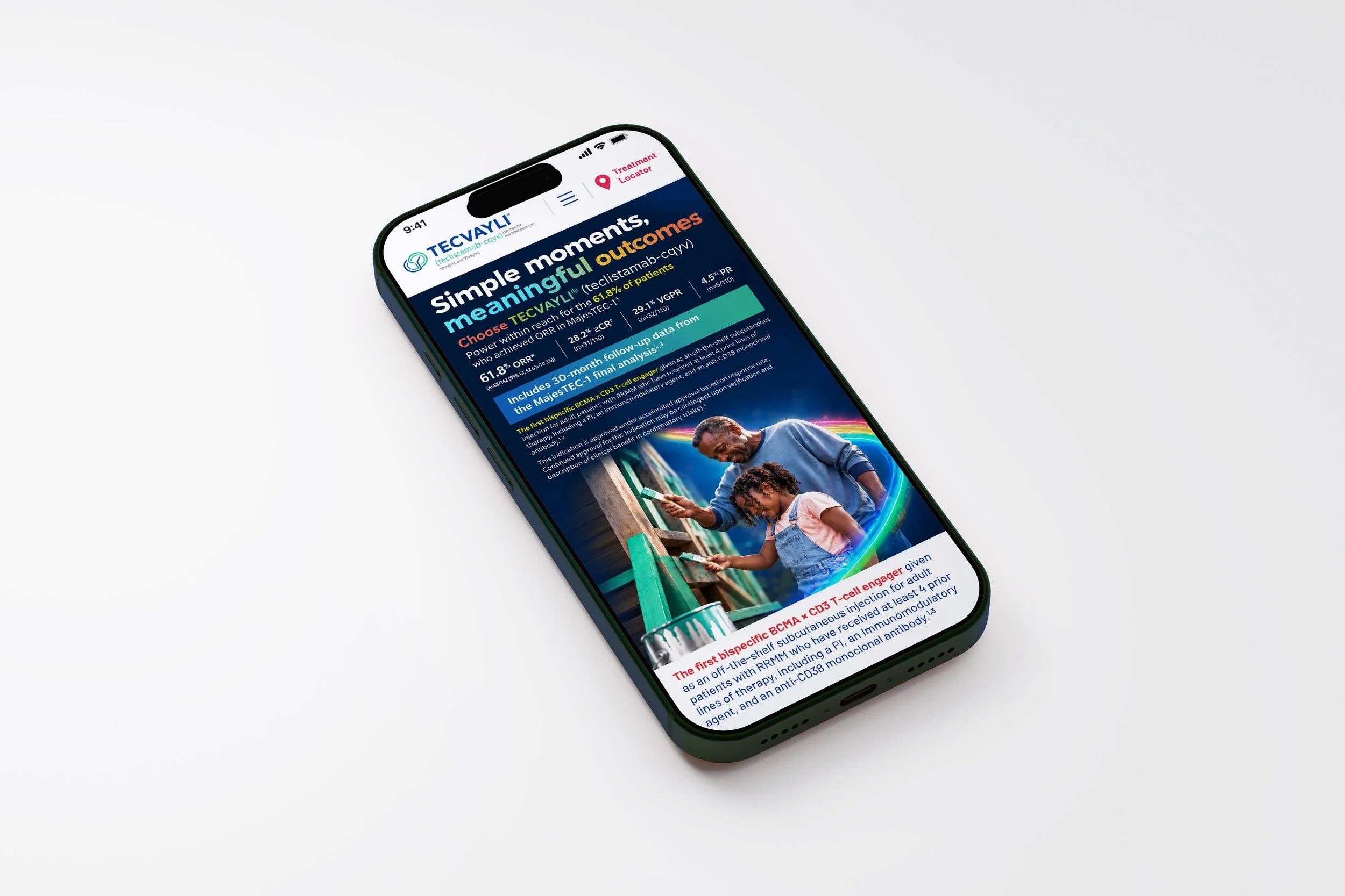
The website experience needed to carry clinical messaging, efficacy language, safety information, and branded storytelling in a format that felt contemporary, and trustworthy extending the campaign system into a fully digital environment.
SALES ENGAGEMENT
A visual sales aid for face to face clarity and focused discussions
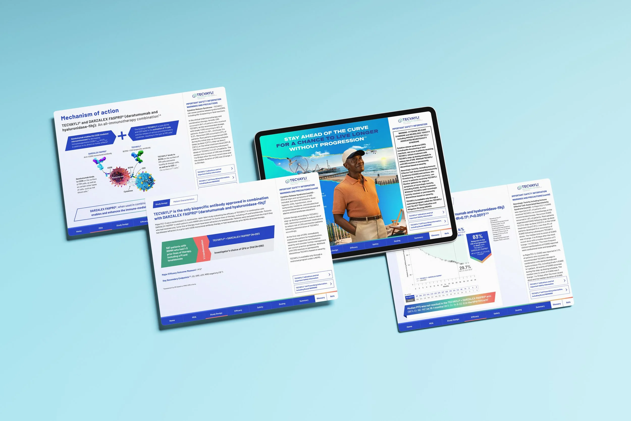
The HCP visual sales aid brought together mechanism of action, study design, efficacy, safety, and key clinical content into an experience built for conversation, clarity, and confidence. The challenge was not just visual consistency, but making dense medical information feel structured and digestible.
TAKEAWAY