
Designing a more expressive experience for the world's largest professional network.
My role: UX Design
LinkedIn has become the de facto platform for job searching and professional networking. With over 1.2 billion users worldwide, its popularity and resulting saturation have become its problem.
For creatives showcasing their work, this problem is simply the beginning.
The Challenge.
The Opportunity.
Professional networking wasn't built around creative portfolios.
LinkedIn's core infrastructure was engineered for resume-first job seeking. As the platform grew into a media and creator ecosystem, a structural tension emerged: the tools creators needed to showcase work such as galleries, project context, process documentation simply didn't exist at the depth required.
The opportunity was to extend LinkedIn's trusted professional ecosystem with a dedicated creator layer without disrupting the platform's signal-to-noise balance that made it valuable in the first place.
Mapping the Landscape.
Before proposing solutions, I benchmarked how platforms across professional networking, portfolio hosting, and social media handled creative expression. This gave an opportunity to identify gaps LinkedIn could uniquely fill.
SWOT Analysis
to find strengths, weaknesses, opportunities and threats
Comparative and Competitive Analyses
to see how other brands handle similar user experiences.
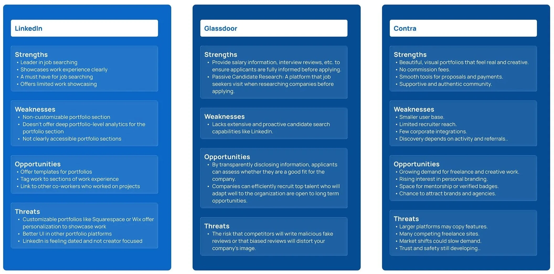
SWOT Analysis
For job seeking, LinkedIn is a professional network for all industries. It feels neutral and polished, however can be overcrowded and users can get lost in the noise.
LinkedIn Recruiter is a helpful tool for Recruiters to find specific roles and candidates.
Comparative Analysis
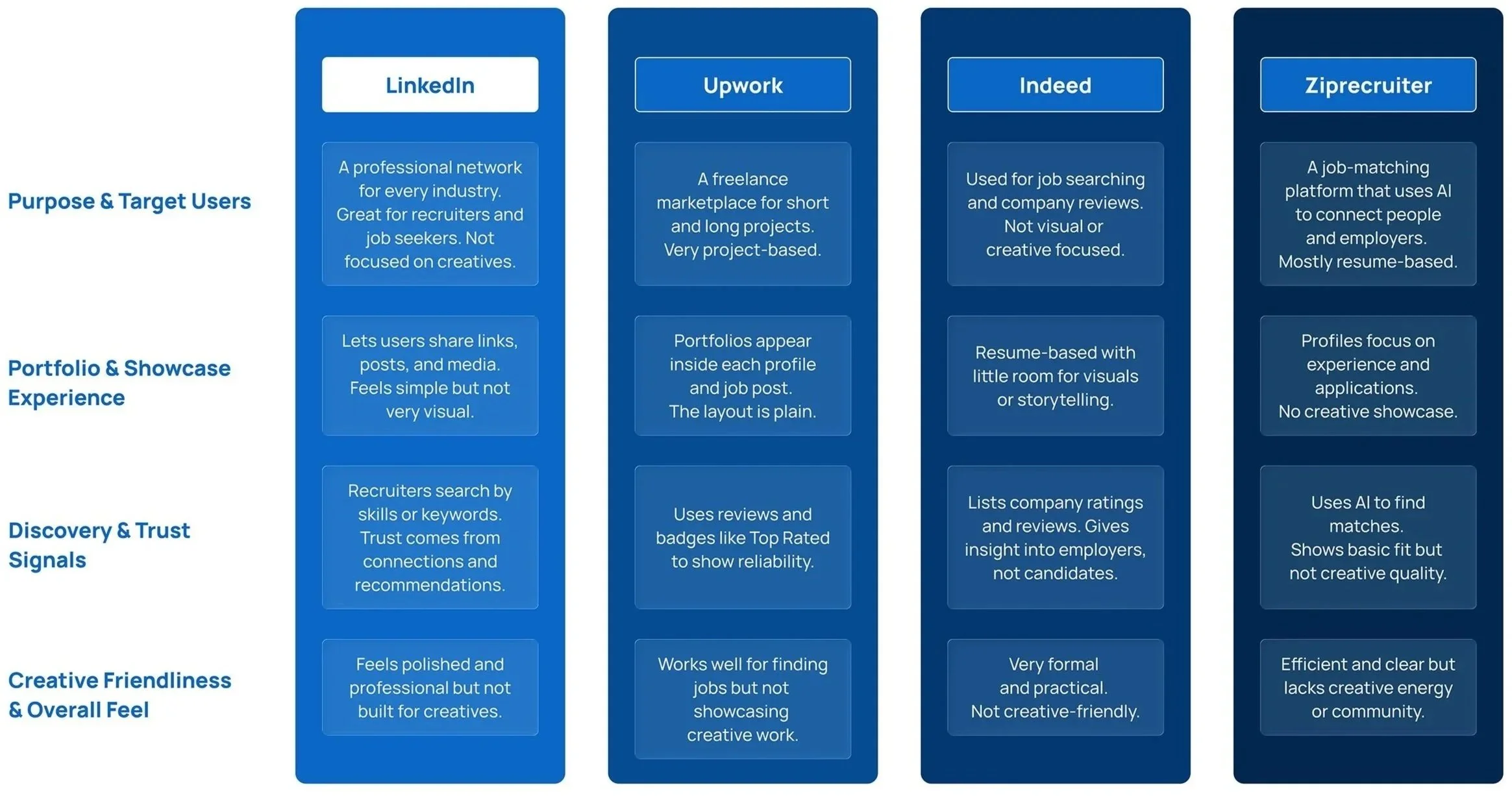
Competitive Analysis
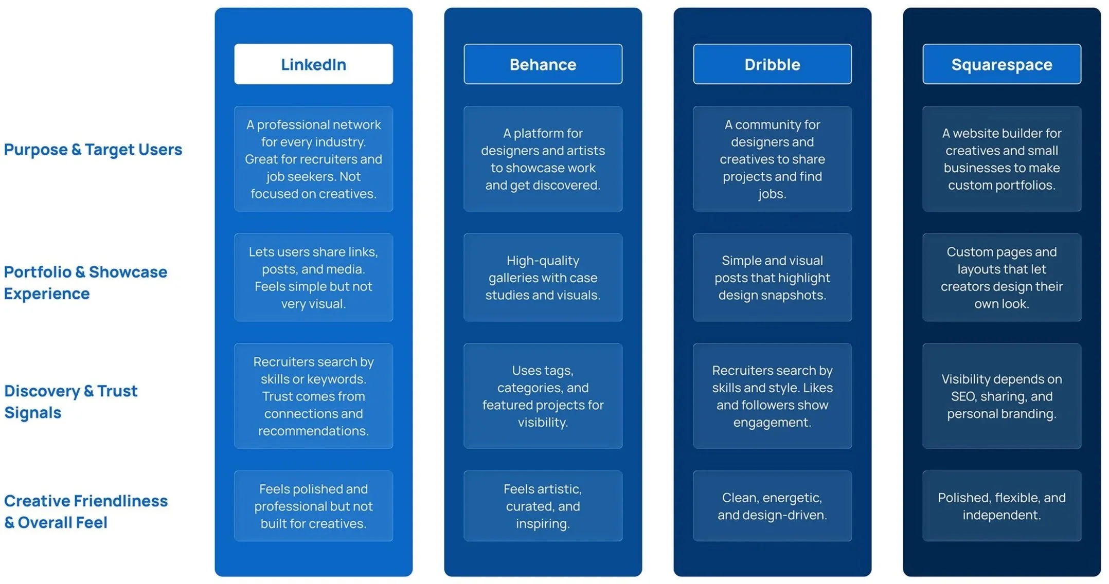
When it comes to showcasing work, Linkedin falls far behind.
It offers small sections within work experience but it is never a customizable experience for the individuality focused creator.
Platforms like Squarespace, Framer, or Weblow offer templates organized by discipline and Dribble offers a community focused approach, while Behance utilizes tags and categories for better project visibility.
Competitive Analysis
Two users. Two needs.
One system.
User Personas
Interviews and contextual inquiry revealed two distinct mental models. Creators needed self-expression and discoverability.
Recruiters needed signal clarity and credential verification. Designing for both without compromising either was the core tension.
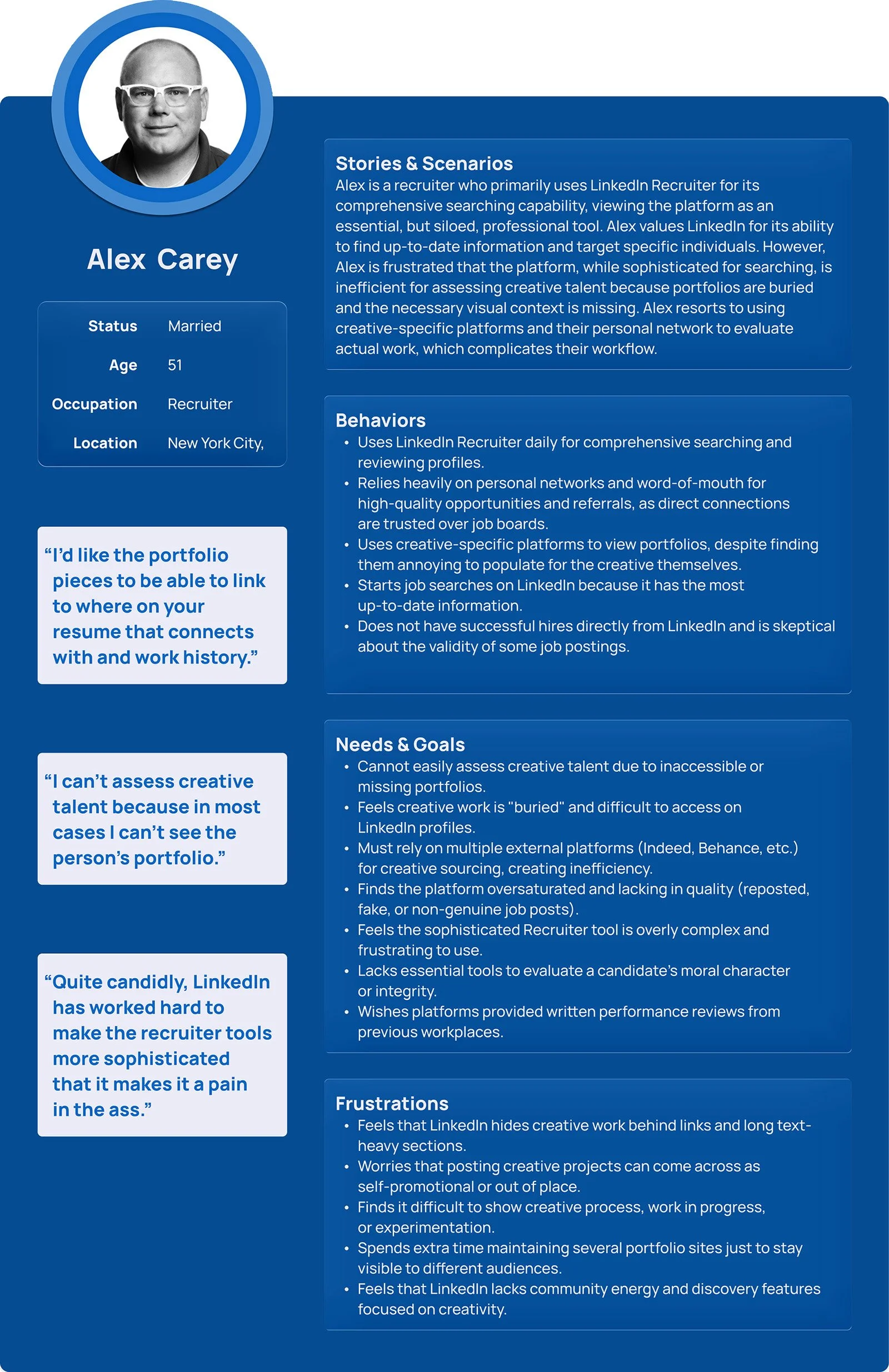
Recruiters
Our recruiters we interviewed rely on LinkedIn Recruiter for precise, up-to-date talent search. While essential for sourcing, the platform falls short for evaluating creative work.
Portfolios are buried and visual context is missing. As a result, recruiter must turn to external platforms and personal networks to assess talent, fragmenting the hiring workflow.
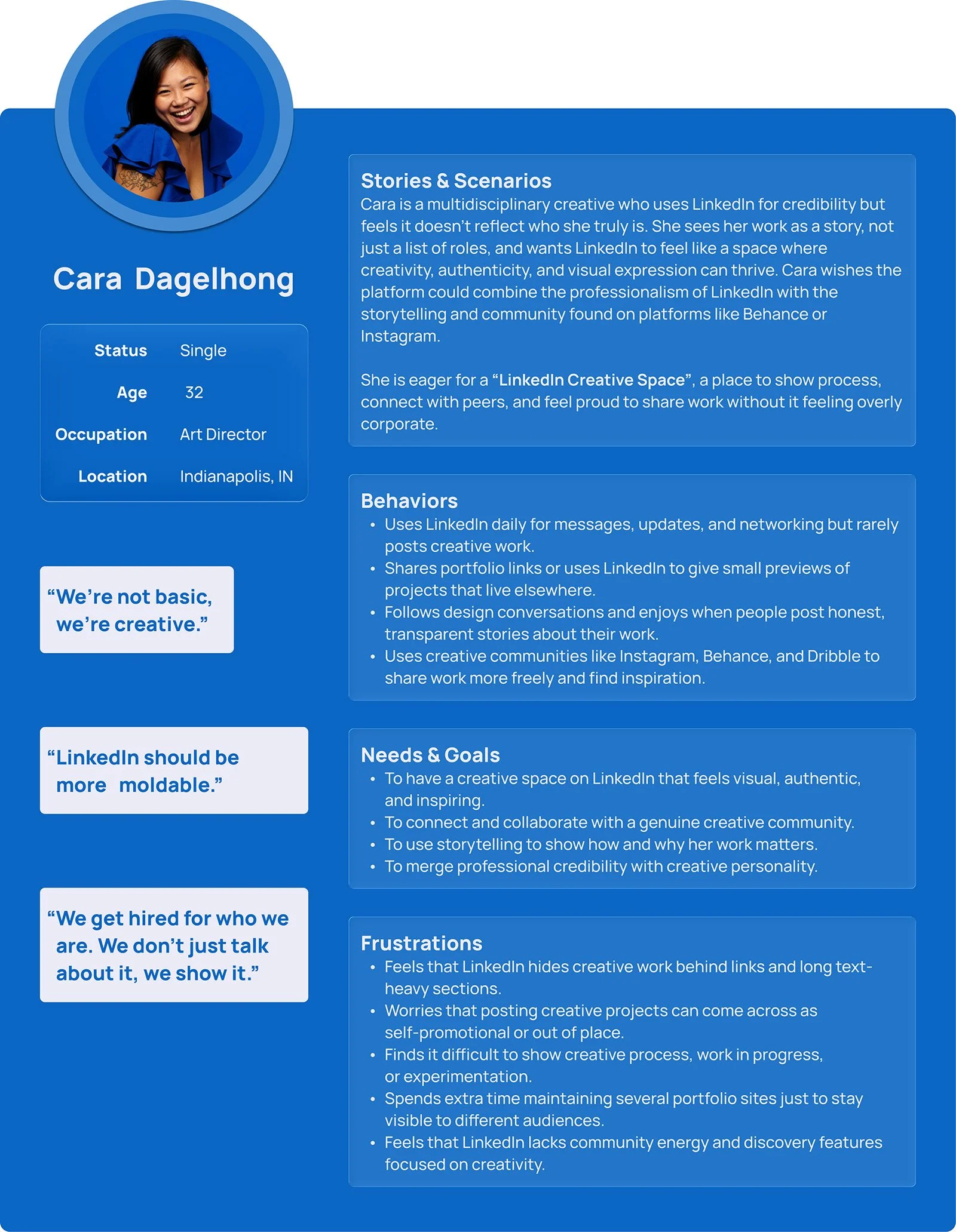
Creators:
They are multidisciplinary creatives who use LinkedIn for credibility.
Linkedin caters to new professionals and seasoned veterans across all creative disciplines. It is currently a one size fits all platform which doesnt align with nuanced creative work.
The work needs to stand out and function differently depending on the discipline. Creatives love to express themselves in their chosen medium and remain professional and business forward. Storytelling is key and sharing their experiences are a must.
"I can tell within 10 seconds if someone is the right fit. But the way LinkedIn shows work makes everything look the same."
-Recruiter Interview, Round 2
“We’re not basic!”
-Maiqui L, Art Director
Affinity Mapping
Affinity Mapping with147 observations from 12 user interviews, clustered into 6 primary themes around expression, discoverability, trust, and workflow
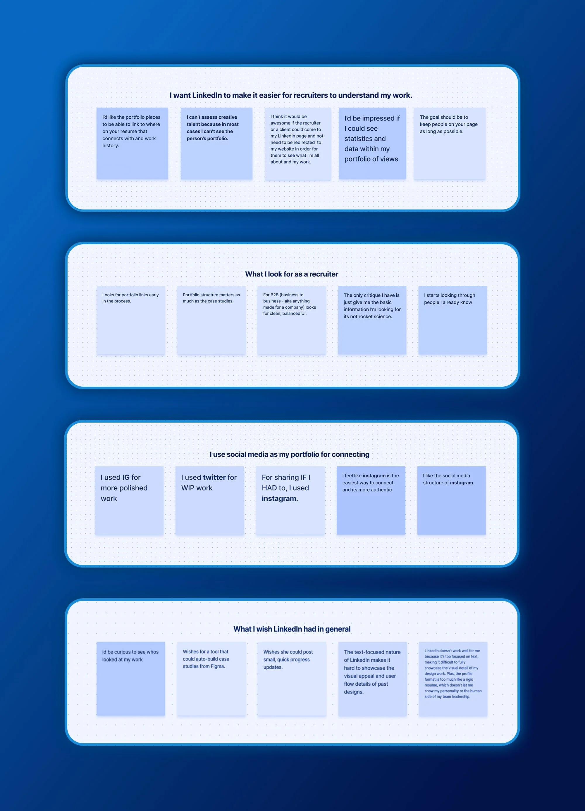
A small sampling of the results from the recruiter focused affinity mapping
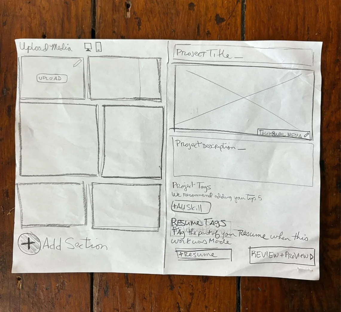
Thinging in Sketch first
Before any digital tool,sketching is a solid way to get thoughts into the physical form. The goal is velocity over fidelity and trial and error. The mission here is to generate enough divergent directions to stress-test assumptions before investing in high-fidelity screens.

Low-Fi to Mid-Fi to High-Fi
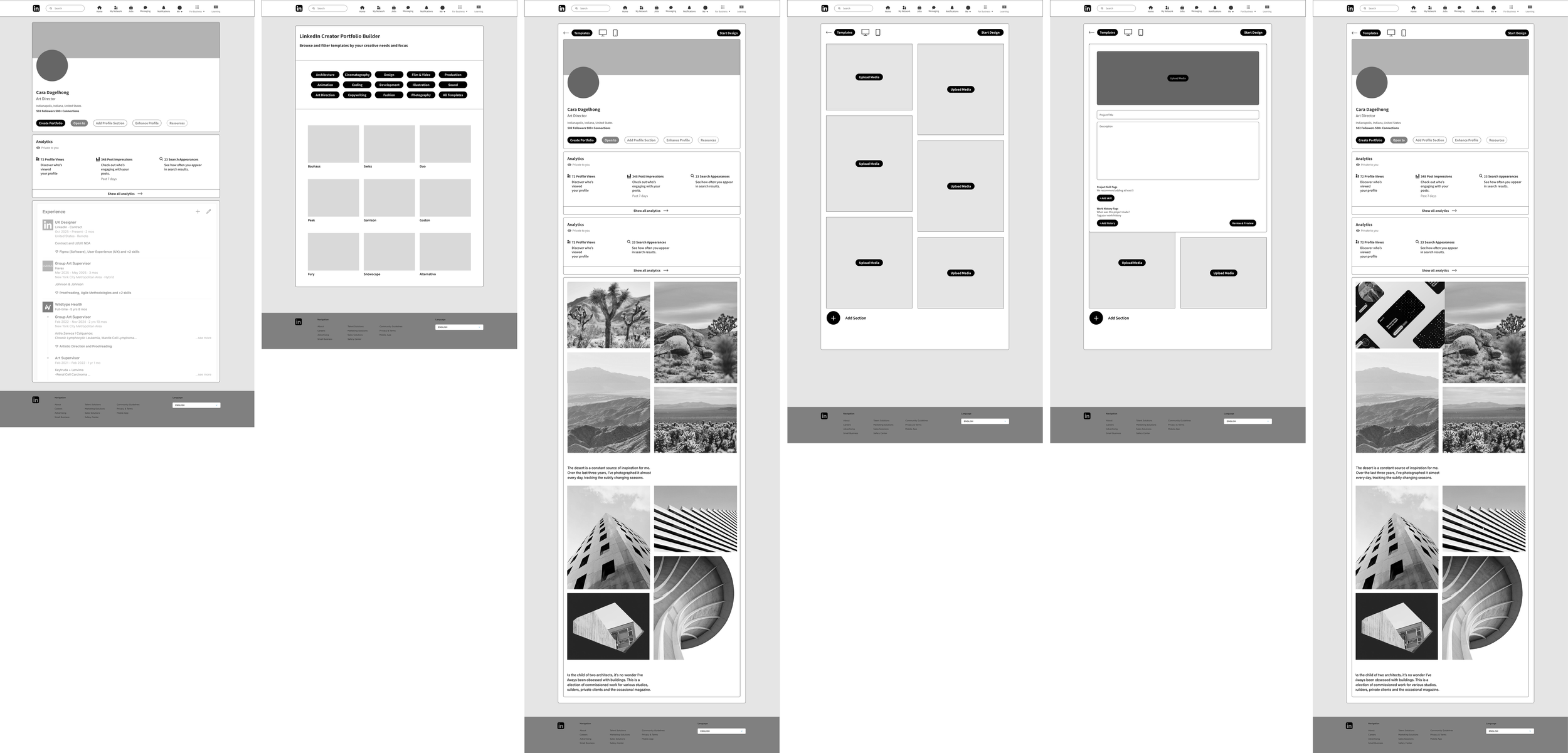
Mid-fidelity wireframes brought layout decisions to the surface to show content hierarchy, information density, and interaction patterns. This is a way to get the ideas cleaned up and focused on structure before any visual language and branding was applied. Six screens explored and designed directly in Figma.
Design Opportunities
• Showcase creative portfolios
• Easier navigation for recruiters
• A robust creative community
• A more customizable portfolio
• Verified creator accounts
Concept & Ideation
I was tasked with designing for the portfolio builder that would be housed within LinkedIn’s desktop page.
After research with brands like Squarespace or Framer, desiging a portfolio on mobile is doable but due to size, scale, and accessibility, it was really not preferred.
With this in mind, our logical move was to build the portfolio on desktop and optimize the layouts to be viewed for mobile.
Prototyping
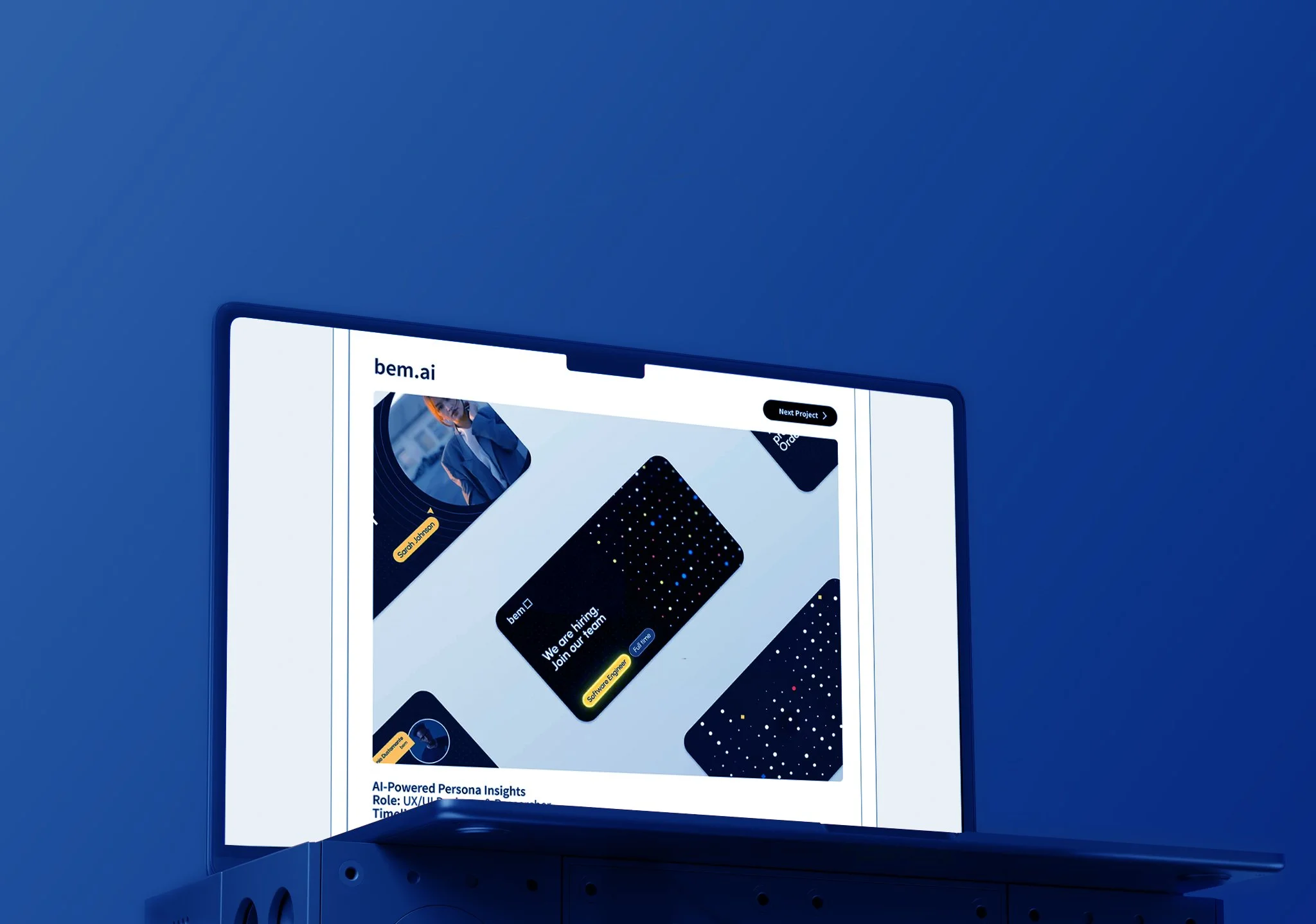
Figma prototypes of the portfolio builder were built for user testing.
The Creator Hub
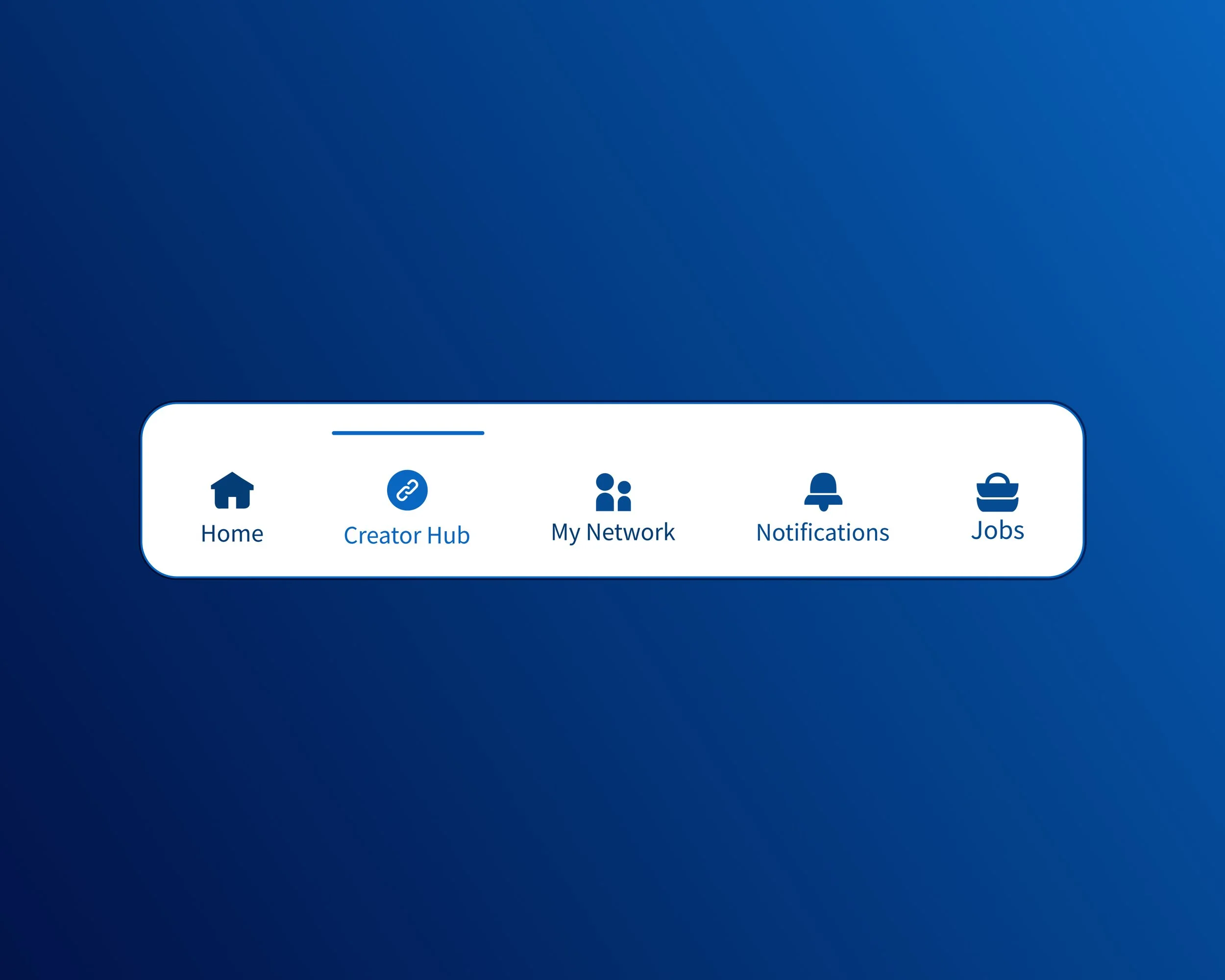
We had a lot of creatives who desired a stronger community and easier access to it. Think a TikTok experience but for LinkedIn creative portfolio work.
The Creator Hub became that place where creatives could discuss jobs, comment and critique in a professional setting, and share work.